Plan Ahead

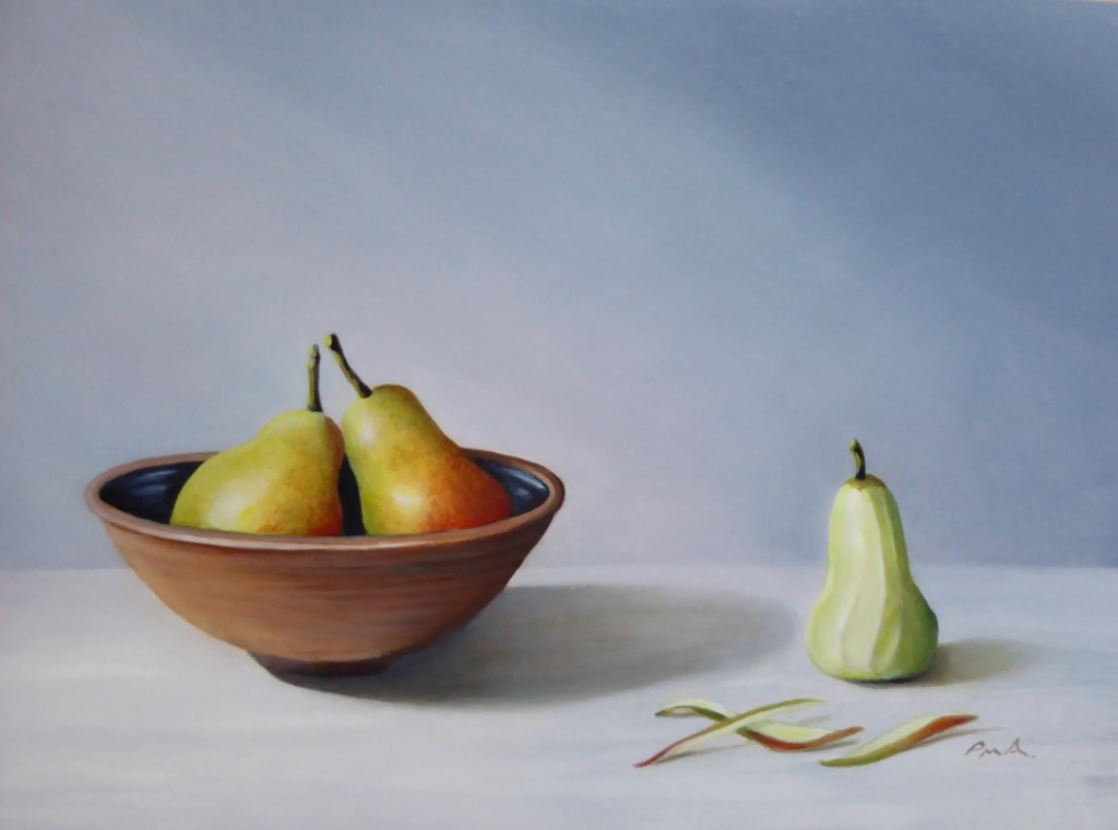
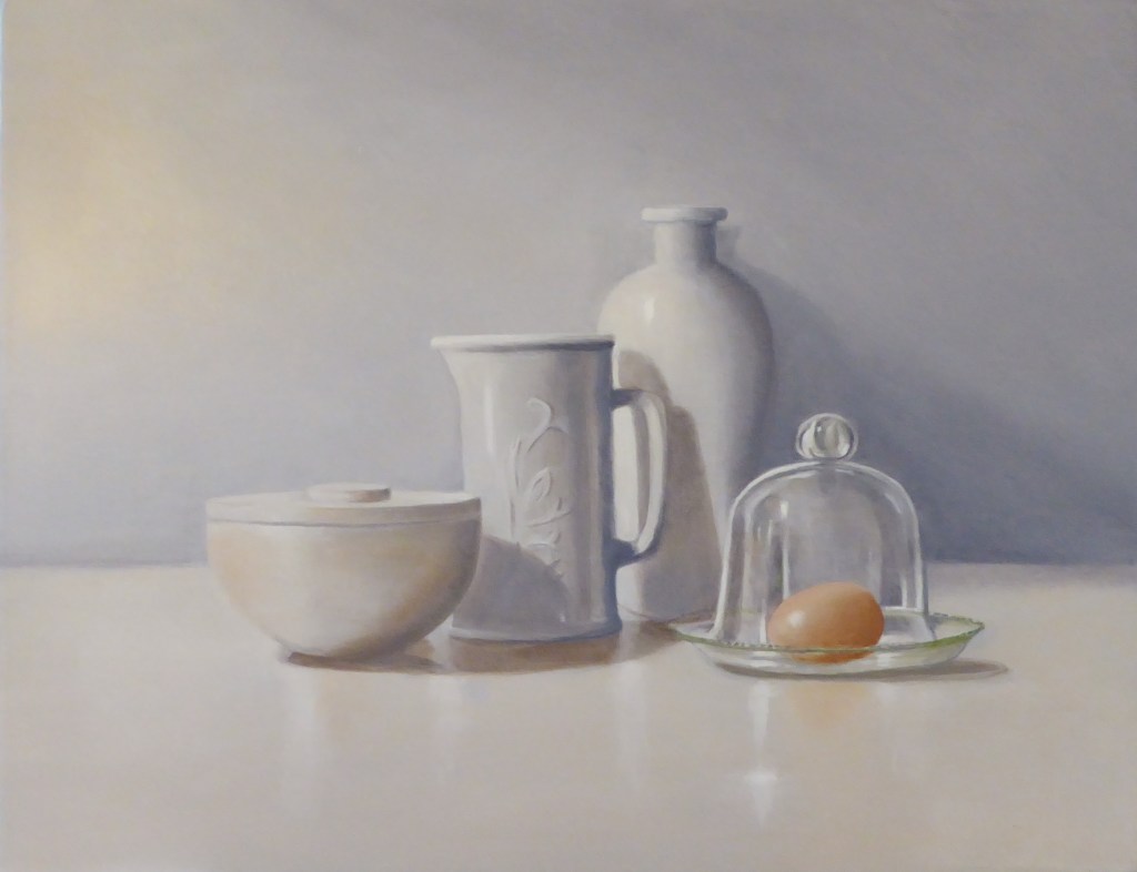
Now January is out of the way, a time for contemplating rather than doing, I find. I now feel I can start planning for the coming year. With several exhibitions on the horizon I need to decide what to paint in the next few months in preparation. I have recently done a couple of colourful watercolours of individual Tulips which are such elegant flowers and bring thoughts of spring. You can see them on the watercolours page. Also an oil painting of pears called “Pared”! I like the minimalism of them. I am also planning to paint some more unusual still life items and compositions which will be fun to try out. So watch this space.

Time for change?

I never feel that January is the beginning of a new year for me. It’s usually cold and wet and not at all conducive to making plans that require effort and determination. I prefer to do that in the springtime when everything appears more optimistic and achievable. So my New Years resolution would be to defer any major changes in direction until then!

2021 was a good year for me artistically once it got going after the lockdown, a period I seem to have erased from memory. Suddenly exhibitions and open studios sprung into life and we all made up for lost time. These were all the more enjoyable for the lack of events on our agenda’s for so long! Every cloud has a silver lining I suppose.

I have nearly finished a painting that is based on “the whiter shades of pale”. I have long been a fan of the song, and of light ethereal images that have a ghostly and dreamlike quality, which I have tried to capture. It will be exhibited sometime in the spring, my favourite season.

Annual Bath!

Every year my husband and I take a long weekend trip to the gorgeous city of Bath. We go to meet up with a friend, shop in the interesting arcades and streets and take in the Art Museums, galleries and bookshops for which Bath is renowned. If you get the chance I can recommend The Beaux Arts Gallery which is housed in a beautiful Georgian building in York Street. It is one of the most well displayed galleries I know and knocks spots off some of the more well known ones in London! The artists are well selected and inspiring. It is opposite a fantastic book shop, Topping and Company which is also in a wonderful classical building. Another lovely gallery is Red Rag which is at the upper end of the city in the charming Brock Street, with one or two cafes and an old book shop, off the beaten track, so good to go to when the centre of the town gets crowded. It always has a lovely collection of contemporary art and sculpture on display. Then of course there are great dining opportunities in Bath. I recommend La Terra, a Sicilian/ Italian cafe recently opened. All it lacks at present is some good art work for it’s ,as yet, bare walls!

Autumn Colours

I have been tempted to paint the comfortingly warm colours of autumn in my latest painting “Mulled Wine”.(see under Oils) The tonal colours make for a restful image and invite thoughts of cosy evenings to get us through the winter. Inspiration comes from many sources, this one was from seeing a row of copper pots and pans in an interior decorating magazine. I like my paintings to tell a bit of a story or for there to be link between the items chosen, so I chose objects that you need to make mulled wine, fruit wine and ground spices. The long format makes for an interesting composition.

A colourful day out?

On Monday 1st November the Dorking Group of Artists opens it’s new exhibition at the Denbies Wine Estate. I always look forward to this one as it is a large exhibition, with over 200 works to look at. So something for every taste and the Private view is always fun to attend and to meet friends and buyers. I have exhibited with this Group since 2009, my very first exhibition! I find that the strictures of presenting work to the public really ups your game and, looking back, I think it has had a very positive influence on my working practice.

If you are looking for something colourful and uplifting to do next week the show is on Monday to Saturday in this lovely location. If you wish to attend the Private view on Monday evening please contact me. pallbeury@gmail.com

The Royal Academy Summer Exhibition. A view.

I went to this annual summer event with a little trepidation having watched the BBC preview programme. It seemed that a lot of the art they reviewed had to have some deep, political or sad significance in order to get selected. I paint for the pleasure of finding the beauty in everyday subjects, they may have a significance to me but I hope the viewer finds there own story and I hope it is an uplifting one.

With over a thousand art works to see at the exhibition there was something for all tastes, so of course I found plenty to admire and inspire me along with many that I could not fathom why they were chosen! That is the joy of The Summer Exhibition, stuff to shock, to question, to amuse, to enjoy and to make you think outside the box. I was drawn to the more spare and minimal pieces with a figure or object in a large space. So that could be my next inspiration for a new painting.

Italian Style Inspiration

I have just returned from a short visit to my favourite place, Venice. It was so lovely to be able to visit this inspirational and unbelievably beautiful city again, an artist’s dream! I always come back with new ideas for paintings. It is such a stylish yet classically inspired culture there. I hope that influence will rub off into my work over the coming months until I can go there again!

My next exhibition will with the Surrey Hills Artists at Denbies Vineyard, Dorking. I look forward to meeting some of my friends and collectors there.

Music and art

Ronnie wood, Rolling Stone musician and artist says that “Music is art and art is music on paper”.

I think that is an interesting idea. When composing a painting I am always aware of seeking for the harmony in the chosen colours, shapes and textures. As in music, repetition in art, of shapes and colours, gives a pleasing rhythm to the piece. The varied textures conveyed are like different instruments and the soft and”loud” passages of paint give it it’s mood.

Blue Hues watercolour painting £150 framed 46.5 x57.5cms This painting will be in the Surrey Hills artists exhibition at Denbies Vineyard Gallery 11th-24th October 2021

News update

I have just finished at the Fircroft Exhibition which went brilliantly, lots of sales by all exhibitors and enjoyed by an enthusiastic and appreciative public. I am busy replenishing my stocks inspired by the art on view and by the slight but inevitable Autumnal feel with September almost here. Deeper and warmer colours come to mind…

Ever onwards, I am now planning for the upcoming Surrey Hills Artists exhibition 11th-24th October and the Dorking Group of Artists one soon after, 1st -6th November, both will be at the lovely venue of The Denbies Vineyard. After the last 18 months dearth of opportunities to exhibit, this year is making up for it!

Thought for today: Simplicity is the ultimate sophistication. Leonardo Da Vinci.

Handsome Peach. Oil on wood block 20 x15 x 2cms £60

What’s it all about

Whilst at the Fircroft exhibition this week one of my purchasers asked me to tell them about the painting. Which made me think. Where does my inspiration come from and why choose a particular subject?

Orchid

In this painting I chose three ordinary objects because they were all highly valued and rare objects centuries ago but are now commonplace. Painting them in a dark space with the light emphasising their colours and shapes helps to see them anew, to realise the beauty of these everyday objects. The even dark background adds a little mystery and creates a serene atmosphere.

I am pleased this painting has found an appreciative new home! From this painting came the inspiration for others using the gorgeous colour of oranges offset by the complementary colour of blue.